The Bookstore currently uses the circa 1954 mascot image of Marcus & Narcissa Whitman on clothing and insignia items that we sell. While we will certainly continue to offer the classic logo on our products, we would also like to add an innovative, contemporary design to our array of choices.
To this end, we are pleased to announce the 2nd Annual Juried T-shirt Design Contest
- We are accepting open submissions for an alternative design for the Whitman College Mascot.
- The contest is open to all current students.
- Selections will be publicly displayed.
- The winner will be by popular vote.
The winning design will be placed on a T-shirt to be sold in the Bookstore on campus, and the artist will receive a semester's worth of free textbooks*.
Stop by the Bookstore to see our T-shirts with last year's winning design by Michael Hanley.
Deadline for submission is 11:59:59pm, January 31, 2010
Please stop by the Bookstore for an entry form & complete contest rules.
* based on actual purchases from the Whitman College Bookstore up to $500
Friday, November 6, 2009
Wednesday, November 4, 2009
Window Decorating Contest
Hey guys, this came out in an email today. Wasn't sure how many of you read it but I think it would be fun.
Event: Window Decorating Contest!!!
Start Time: Monday, November 2 at 12:00am
End Time: Monday, November 16 at 12:00am
Where: Reid Campus Center
To see more details and RSVP, follow the link below:http://www.facebook.com/n/?event.php&eid=162615804599&mid=15bcfc5G4d90d958G113a84fG7
Event: Window Decorating Contest!!!
"We provide the windows and the decorating pens, you provide the art! "
What: Holiday PartyStart Time: Monday, November 2 at 12:00am
End Time: Monday, November 16 at 12:00am
Where: Reid Campus Center
To see more details and RSVP, follow the link below:http://www.facebook.com/n/?event.php&eid=162615804599&mid=15bcfc5G4d90d958G113a84fG7
Wednesday, October 21, 2009
Elements of design and composition
I found this useful website in a search for something else on google. It's about the principles of design and composition; some of these I've heard of before and some I haven't, but it's nicely written. check it out.
http://photoinf.com/General/Robert_Berdan/Composition_and_the_Elements_of_Visual_Design.htm
Tuesday, October 20, 2009
Frank Bauer


From what I can gather, Frank Bauer is a german artist who paints most of his works from photographs in a very photo-realistic style. If the photo is damaged or blurred, then that is incorporated into the painting as well, whether it be red-eye or backlighting. According to his website, Bauer paints portraits, still lives, landscapes, and nightlife scenes. I notice that his paintings of people, women especially, tend to be quite glamorously depicted...
Lucien Freud


http://upload.wikimedia.org/wikipedia/en/9/96/Freud%2C_After_Cézanne.jpg
Lucien Freud was born in Germany in 1922. Interestingly, he is the grandson of Sigmund Freud. Lucien's family moved to England in the 1930's and that is where he received his training in art. He went to Cedric Morris' East Anglian School of Painting and Drawing, and later at Goldsmith's College in England. Early in his career his paintings were often associated with surrealism, as we can see with his painting, "The Painter's Room". A lot of Lucien's later works were comprised of nude. Lucien is still alive, and his most recent paintings' subject matter largely includes horses. Lucien has a peculiar technique as well, one in which he clean his brush after every stroke.
Monday, October 19, 2009
Chris Ofili
Here is a video of Chris Ofili talking about one of his instillation pieces. Wiki says, "
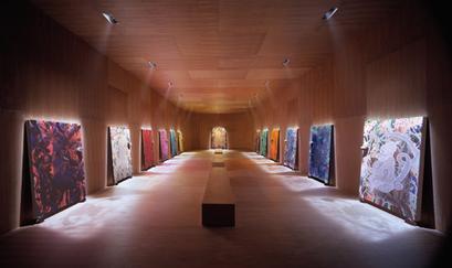
A large walnut-panelled room designed by architect David Adjaye holds the paintings. The room is approached through a dimly-lit corrridor, which is designed to give a sense of anticipation. There are thirteen paintings altogether, six along each of two long facing walls, and a larger one at the shorter far end wall.
Each painting depicts a monkey based around a different colour theme (grey, red, white etc.). The twelve smaller paintings show a monkey from the side and they are based on a 1957 Andy Warhol drawing. The larger monkey is depicted from the front. Each painting is individually spotlit in the otherwise darkened room. The room is designed to create an impressive and contemplative atmosphere.
The paintings each rest on two round lumps of elephant dung, treated and coated in resin. There is also a lump of the dung on each painting. Strictly speaking, each work is mixed media, comprising paint, resin, glitter, mapping pins and elephant dung. The Upper Room as a whole is described by the Tate as an "installation".
The Upper Room is a reference to the Biblical Last Supper of Jesus and his disciples, hence the thirteen paintings. Ofili states the work is not intended to be offensive, but rather to contrast the harmonious life of the monkeys with the travails of the human race."
Ofili offers a wide range of art which I will post more about later. Enjoy.
Inke Essenhigh
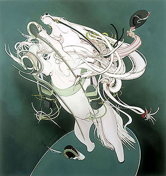 Inke Essenhigh is an American Painter who studied at Columbus College of Art and Design in Ohio and the School of Visual Arts in New York. She has exhibited her work all over the U.S., from New York to San Fransisco, and all over the world, from Sao Paolo, to Belgium, to London. With her unique "pop surrealism" style, she inspired movement of young painters in New York, some of which include Cecily Brown, Damien Loeb and Will Cotton. Her style is exemplified in the painting to the right, "Optimistic Horse and Rider." Her use of flat colors and cartoon-like painting style provide a great flow.
David Hockney

In the video I just posted, David Hockney, a prominent British artist, talks about his views on painting, which actually reflect some of the things we've been talking about. He talks about using the fewest strokes possible, simplifying the painting, deliberately choosing a big brush. He also made me think: What types of things are unphotographable? What can't be captured in a photograph but needs the freedom of paint and canvas to be expressed?
Also, Hackney has been painting since the 50s. Each decade has given rise to a very different look for his paintings. His work in the 80s reminded me of Picasso. Here is an example...
Sunday, October 18, 2009
Jim Lambie
Jim Lambie is a Glagow, Scotland-based artist who applies colored and glossy vinyl tape in patterns on the floors of art galleries.


"Is the room expanding or contracting? … Covering an object somehow evaporates the hard edge off the thing, and pulls you towards more of a dreamscape.” --J.L.
This kind of art can drastically affect the experience of being in the space, especially a quiet one like an art gallery. The designs and patterns on the floor can heighten the emotional experience of the observer/participant walking through the gallery. I imagine the effect is often somewhat disorienting, perhaps distracting, as ones eyes want to follow the lines around the room. Also, I think this art is interesting in the way it cannot be replicated--it is completely dependent on existing within the space in which it is created.
Fred Tomaselli
Fred Tomaselli is known for highly detailed paintings done on wood panels on which he suspends myriad materials (not just paint) in epoxy resin so that his paintings are collages of both material and message. He draws from his disillusioning high school experience in Orange County, creating what some call "a contaminated image." He says about his art, "I want people to get lost in the work. I want to seduce people into it and I want people to escape inside the world of the work. In that way the work is pre-Modernist. I throw all of my obsessions and loves into the work, and I try not to be too embarrassed about any of it. I love nature, I love gardening, I love watching birds, and all of that gets into the work. I just try to be true to who I am and make the work I want to see. I don’t have a radical agenda."


Wayne Thiebaud


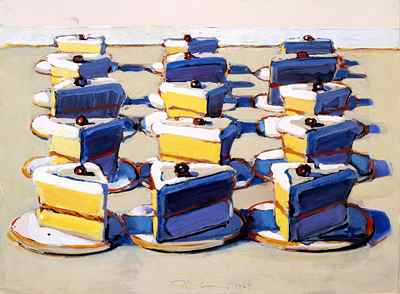
Wayne Thiebaud was born in 1920 in Arizona. He did most of his paintings in the 1950's and 60's. The subject matter of his paintings is mostly baked goods such as pies and cakes. His work is a part of the Pop Art movement, but he painted during the very beginning of the movement. He typically uses brilliant colors and shadows in his paintings.
Saturday, October 17, 2009
Laura Owens


Laura Owens likes big paintings. Pretty much all of her paintings are relatively large. Most of the ones I saw seem to contain animal and tree motifs. They also tend to be more lighthearted content wise. She is an American painter who lives in LA. Her style blends English embroidery, Chinese and Japanese landscape painting, European and American modernism, and photography.
Thursday, October 15, 2009
Helen Frankenthaler
Helen Frankenthaler is considered an artist of abstract expressionism. As such an artist, she is concerned with forms and energies that are in nature. Her art is greatly influenced by Jackson Pollock and Arshile Gorky. Something that makes her work unique is her tendency to leave the canvas raw when she paints. This allows her to connect her image with the surface. Some critics say that this technique allows her to show "liquid-like atmospheric effects reminiscent of the watercolours of John Marin." She is considered a nonconformist in both her art and in her life. 


Wednesday, October 14, 2009
Painting Roses
So, not the most exciting video in the world, but as a beginning painter learning how to paint a rose seems pretty cool. Roses are beautiful and they have a lot of very intricate colors and lines that kind of seem to be a daunting task to paint well. This video, though, makes painting a rose seem rather simple, and the rose still comes out to look pretty good and captures the lines in the petals and creates space pretty well.
Tuesday, October 13, 2009
Bette Davis
Hi Class!
I thought this was cool because I wouldn't ever have thought of mascara as paint or a mascara brush as a painting tool. Notice how the artist uses the brush to create a ton of different effects just by varying the application. Pretty interesting.
-Becky
3-D
These paintings are so cool -- from the other side they look ridiculous but from the right angle they look completely three-dimensional. My question is: how can this be done on a canvas?
Sunday, October 11, 2009
Thursday, October 8, 2009
Robert Vickrey
Although I don't love all of these paintings, I like what Vickrey says in the middle of the video about always discovering new ways to paint and new ways to portray things.
Bruce Lee??
Bruce Lee Speed Painting - Watch more Funny Videos
I thought this was pretty impressive, especially when he uses his forehead to make a mark. The style he uses (karate chops) to apply the paint is almost cooler than the finished product. I wish he had used more colors though...
Tuesday, October 6, 2009
Monday, October 5, 2009
David Hockney's iPhone Passion
Cool NYTimes article about what DavidHockney has been up to recently...on his iphone.
Here are some accompanying pics.


Here are some accompanying pics.
Spray Paint
I like how the painting is created by layering the application of spray paint. It gives the painting a lot of depth, and the end result is very spacial. I also like how it doesn't look like it was created with spray paint.
Sunday, October 4, 2009
a different surface
I really like this video because it shows how just about everything can be painted on and look amazing -- makes me want to experiment more with different surfaces to the results. Also, these are amazing but impermanent paintings, making them all that much more unique
Oh, that Pablo!
This is a pretty sweet video of Pablo Picasso. He is painting on some sort of clear surface and so you can see him through the surface and se what he is painting at the same time. I think what is interesting, besides his brushstrokes is his facial expressions. He's a cute old man!
Thursday, October 1, 2009
"How to Scrape Underpaint in Painting"
Hope you enjoy this technique of scraping (even if this guy is super cheesy)
Friday, September 25, 2009
Thursday, September 24, 2009
From The Daniel Smith Catalog by e-mail

Tuesday, September 22, 2009
"My instinct about painting says, 'if you don't think about it, it's right.' As soon as you have to decide and choose, it's wrong. And the more you decide about, the more wrong it gets." -Andy Warhol.
I like this quote because I can definitely relate to it. I have found in my paintings so far that my best work is produced when I am doing the least amount of critical decision making during the process. I feel like the exercise we did in class where we all contributed to other people's paintings produced some of the coolest and most interesting works that we have done yet, and they were all basically done as just random reactions
Monday, September 21, 2009
Oh, Pablo...
"The world today doesn't make sense, so why should I paint pictures that do?" --Pablo Picasso
This is one of my favorite quotes ever. It speaks directly to painting what is interpreted by the painter. The internalization of what a painter sees and then translates onto canvas is about as intimate as it gets. Here, Picasso touches on that, as well as making a small social commentary.
This is one of my favorite quotes ever. It speaks directly to painting what is interpreted by the painter. The internalization of what a painter sees and then translates onto canvas is about as intimate as it gets. Here, Picasso touches on that, as well as making a small social commentary.
Sunday, September 20, 2009

I just really wanted to share this awesome piece with you guys! Some of you might recognize this from outside Coffee Perk Cafe in downtown Walla Walla. This is the third or fourth time I've seen it and every time I do, I am more inspired than the last. Stenciling has a special place in my heart and I have always enjoyed it. This particular piece is so simple yet very visually dynamic. The background is very neutral even with so many contrasting hues of grey and white. The different shaped lions provide depth and give the only "color" to the piece. Lastly, I think that the entire piece was framed particularly well with the white foliage in the bottom and black outlines of lettering up above. Not to mention that this is on a newspaper dispenser! All in all, I think this piece has a lot of things going on and every piece of it is executed perfectly, at least from a stenciler's point of view.
Quote
“I like the fact that in ancient Chinese art the great painters always included a deliberate flaw in their work: human creation is never perfect.” - Unknown
I like this quote a lot because it mirrors a lot of what we've been doing in class recently, how we've been deliberately going back to paintings that to some could be deemed as finished or done, but aren't. This is powerful motivation to continue to work on a painting. The view presented here also hinders the practice of obsessing over a painting until it is "perfect." That idea in itself is very appealing because it can be so frustrating when you just can't get something right, but with this "ancient Chinese" attitude, leaving it that way becomes a deliberate and humble move.
Saturday, September 19, 2009
"When we are writing, or painting, or composing, we are, during the time of creativity, freed from normal restrictions, and are opened to a wider world, where colors are brighter, sounds clearer, and people more wondrously complex than we normally realize." --Madeleine L'Engle
I like this quotation because it points to the fact that art doesn't have to be totally realistic - in fact, perhaps shouldn't be realistic when the world can be expressed in so many exciting ways. And I can also relate to that feeling of magical clarity and complexity coming at you at the same time "during the time of creativity" ...
Thursday, September 17, 2009
“When I am in a painting, I'm not aware of what I'm doing. It is only after a sort of 'get acquainted' period that I see what I have been about. I have no fears about making changes, destroying the image, etc, because the painting has a life of its own. I try to let it come through. It is only when I lose contact with the painting that the result is a mess. Otherwise there is pure harmony, an easy give and take, and the painting comes out well.”
-Jackson Pollock
I like the idea of the painting as a sort of person. I like that it has a life, and you must "get acquainted" as you work with it. The idea that it is its own being allows some sort of inevitability to painting. It makes the painter seem like a sort of tool that must let the painting's life show. I enjoy thinking that it is when one lets go, doesn't think about it, and works with the painting that the best things occur.
Quote
"Are we to paint what's on the face, what's inside the face, or what's behind it?"
-Pablo Picasso
When a group of people are given the same object to paint, each painting will turn out differently. The painter decides what to include in the painting, and it is open to their interpretation. This makes every painting unique.
-Pablo Picasso
When a group of people are given the same object to paint, each painting will turn out differently. The painter decides what to include in the painting, and it is open to their interpretation. This makes every painting unique.
"I had always loved expressionist painting, like every European. In fact I admired it all the more because these were precisely the paintings despised by my father's generation."
-Georg Baselitz
Although not really about the act of painting, I like this quote because it reflects how art is constantly changing, and how people's tastes are constantly changing. I think that in my lifetime I will see a change in art, and I look forward to seeing what comes next.
-Georg Baselitz
Although not really about the act of painting, I like this quote because it reflects how art is constantly changing, and how people's tastes are constantly changing. I think that in my lifetime I will see a change in art, and I look forward to seeing what comes next.
Muto
I don't think it's an exaggeration to say that this may be the most amazing video you've ever seen.

Wednesday, September 16, 2009
White Oleander
I just finished the book White Oleander by Janet Fitch. It's an amazing book that everyone should read. In this book, the main character, Astrid, is quite the artist. I love the way that Fitch portrays how she thinks and feels about art. In this quote below, Astrid talks about how the world was made to be comprehended through art. It is very beautiful both in content and what words Fitch uses.
"I gazed down at my drawing of Rena, dotted with water from the sprinkler. Really, I didn't even like drawings. When I went to the museum, I looked at paintings, sculptures, anything but lines on a piece of paper. It was just that my hand needed something to do, my eye needed a reason to shape the space between Rena an the sprinkler she had running and her wobbly-legged tabel of rusted white diamond mesh that held one drink and an ashtray. I liked the way the tabletop echoed the black diamonds of her bikini and the chain-link fence, how the curve of her tumbler was the same as the curve of her raised thigh and the taller man's arm draped over the fence, and leaves on the banana tree at the Casados' house across the street.
If I didn't draw, what reason would there be for the way the light fell on the scallop of tiles on the Casados' roof, and the lumpy tufts of lawn, the delicate braids of green foxtails soon to go brown, and the way the sky seemed to squash everything flat to the earth like an enormous foot? I'd have to get pregnant, or drink, to blur it all out, except for myself very large in the foreground."
some words about painting
- Painting is easy when you don’t know how, but very difficult when you do.~ Edgar Degas
Painting quote
"I've been doing a lot of abstract painting lately, extremely abstract. No brush, no paint, no canvas, I just think about it." -Stephen Wright
Tuesday, September 15, 2009
Sergei Bongart: Notes on Painting
Sergei Bongart: Notes on Painting
Compiled & edited by Norm Nason
Compiled & edited by Norm Nason
True art has passion and contains insight. It shows us a new way of looking at our world. As Matisse would say, it helps us to see with the fresh eyes of a child. Art is the great renewer of life. Impatience is the only threat to this prescription. It is all in the mileage invested. As Robert Henri says, do lots of starts and the finishes will take care of themselves.The following essay about Russian/American artist Sergei Bongart (1918-1985) is the best, most succinct treatise on painting I've ever read. Gleaned from notes taken by Sergei's students while under his tutelage, these insights are a priceless introduction to painting. This text may be distributed freely, but may not be sold for profit. Please give credit where credit is due: Sergei Bongart.
In art, the hardest skill to learn is to be simple. As artists, we have a natural inclination to create detail; we must overcome this tendency. The first rule is to begin big and simple, then move toward small and complex.
The best art amazes us because of what the artist left out, not because of what he or she put in. If everything is included, why not photograph the subject instead? Any beautifully rendered detail can be strengthened by this editing process. Even a photo-realist must leave some things out. It is the artist's job to only put in the information that speaks to the relevant issues.
Before you begin, ask yourself what should be seen first within your painting, and what you want to say about it. Areas of greatest contrast will attract the most attention. This is your first reading. A strong composition usually facilitates three good readings.
Understand the basis of composing a picture in color. No color should be viewed in isolation, but rather in constant relation to what is around it. A color is what it appears to be only because of its relationship to the surrounding colors. Nothing exists in isolation. Each previous color choice must be re-evaluated as a new color is placed along side of it. If you change one color, you have in effect changed them all.
When we paint, we really aren't copying the colors of nature, we are painting the color relationships. We don't have the color palette that nature has, so we must give the illusion of truth through the relationships of the colors we choose.
As in chess, try to think several moves ahead, painting the color relationships that are deemed integral to the picture. Always make the next most important move. Don't paint in nose highlights, for instance, before you have established the background colors.
TO READ THE REST OF THIS STATEMENT, click here
Monday, September 14, 2009
Hipsters and Facebook
Hello class,
This article game out in Adbusters about a year ago and I thought it was really interesting and relevant as the "hipster" trend increases in popularity both around campus and the nation. Give it a read and see what you think, are hipsters really that bad?!
https://www.adbusters.org/magazine/79/hipster.html
Also, an interesting piece is this take on Facebook-- is it blocking us from reality?! This piece convinced me to quit Facebook for a few weeks last year but I couldn't last without it. Now I appreciate Facebook much more as a social tool rather than loathing it for constantly distracting me.
https://www.adbusters.org/magazine/80/quit_facebook.html
Best,
Todd
Thursday, September 10, 2009
Hey guys,
I thought I would send you something that came in the student list serve today in case you don't read it.
Pulitzer-prize winning cartoonist, Joel Pett, will be on campus the week of September 21 and will, in addition to a public talk titled "What in the World is so Funny?", offer a couple of open forums directed at those interested specifically in cartoons related to environmental issues and those interested in issues related to free speech, the first amendment and corporate media (I will send announcements regarding these events later; please go to http://www.whitman.edu/content/global-studies/events for more information).
At this time, I would like to bring your attention to a workshop that he is offering that he describes thus:
DRAW YOUR OWN CONCLUSIONS: A Hands-on workshop on originality, creativity and satire. A freewheeling demonstration and no-holds-barred discussion of the creative process. Joel Pett is certain that we all have "an innate and natural bent for forceful self-expression." So how do we tap into it?
Since this is an interactive session, spots in these workshops are limited.
The workshop for students is on Thurs, 9/24, 8-9 pm in Maxey 142. To register, please go to http://www.prestoregister.com/cgi-bin/order.pl?ref=globalstudies and click on the appropriate registration link.
This event is sponsored by the Ashton J. and Virginia Graham O’Donnell Endowment for Global Studies.
Shampa Biswas
Director of Global Studies and Chair of the Department of Politics Whitman College
345 Boyer Avenue
Walla Walla, WA 99362
509-527-5895
Tuesday, September 8, 2009
FEMME

I found this work by Wilfredo Lam, a Cuban artist, in a biographical book entirely in French (this made it difficult to decipher much about the artist). It’s titled “Femme (Portrait de H.H.),” meaning Woman. What I like about this piece, like a lot of the artist’s other work, is that even though the figure is quite abstracted, you can still see exactly what Lam is painting, as well pick out what I think of as the more formal elements of drawing and/or painting: line, form, texture, color, shadow, etc. He’s not creating a naturalistic painting, but he’s not just lobbing paint at a page either (not that I’m against that). It’s like that saying… something about, it takes a really skilled singer to be able to sing out of tune. Just as I think it takes a really skilled artist to be able to represent an unrealistic whole in a realistic manner. I love the way the woman pops out of the page against the orange background and the almost unfinished look of the color next to the black line. I think of Lam as giving us a chance to finish the piece ourselves in our own minds.


Monday, September 7, 2009
Cat From The Wrong Side Of The Tracks

Theodor Geisel (Dr. Seuss) made this piece in 1997. I was fascinated by detail Geisel paid to the objects in this piece. It looks as though the streetwise cat is actually in a smokey bar about to take a shot on a strange pool table. Sometimes it looks natural, but a second later I'll see the cat's eyes or the odd blocks on the table and the whole piece appears dream-like. This piece seems to play jump-rope with reality.
Wing of Beauty

This painting by Maria Skrebstova fascinates me because of its colors and openness to multiple interpretations -- at first, I saw a pheonix in the painting, then a tulip in the wind and lastly, a colorful frog about to shoot out its tongue. I like how the abstract can seemingly become anything. Also, the brushstrokes all in a similar direction add to the flow of the work, making it seem effortless.
Blue and Green Music

This painting was created by Georgia O'Keeffe in 1919, and it is an oil painting on canvas. I was intrigued by this painting while I was looking through a modern art book. I was first attracted by the colors, but then I looked at the way the waves and lines move your eyes down to one focal point. I found myself examining each part of the artwork, but I always ended up at the same spot. I enjoyed looking at the painting because of the movement and hues, but I further appreciated it after seeing the title which is Blue and Green Music. I imagine music to flow just like the lines in this painting. There is also contrast with the dark streak in the middle, and music also has contrast. I think this depiction of music is unique, but works wonderfully in connecting art and music. In my mind, the title and what is depicted coincide perfectly, which is why I enjoy looking at this piece of art. Some people, myself included, might look at it and think the colors flow well, but without looking at the title, I believe the painting cannot be fully appreciated.
Naughty Pete, 1913

Naughty Pete was a comic by Charles Forbell that ran in the New York Herald; this strip is from 1913. A lot of the conventions of the comic strip from this time period are evident here: the tall, narrow format (this would have likely taken up an entire page), numbered panels, and flat, two-dimensional staging (before the influence of film began to produce more dramatic angles) all set this squarely in its time. However, Forbell makes some interesting choices here with color and composition. Most of the strips of this time were lavishly handcolored (Winsor McCay's Little Nemo being a famous example) and I find it interesting that for whatever reason, Forbell chose to limit his palette to this cream-of-spinach green and red, leaving only the statue and the child white. The writing and story in this strip is pretty thin (and there are a lot of bizarre moments: for example, the father seems to be carrying the statue in like it weighed as much as a coatrack, and once it's unveiled as the Venus the Milo, he decides the best place for it is on the bannister?). But Forbell's composition is here is really cool. It was rare for cartoonists of this time to experiment with slanted panels, and he carefully lays out the page so that Pete's narrative proceeds up a metaphorical and visual staircase of escalating tension, until at its climax the single long panel perfectly conveys the length and speed of his descent. As a single image, the comic actually works better than a lot of McCay's compositions- the color and the big diagonal lend it a unity of form. Hell yeah comics.
It Has No Title


Okay, so these pictures I have scanned belong to "The Berlin Wall", a fascinating book by Hermann Waldenburg. They are all photos of different parts of the wall that divided the German capital in two for 27 years. Apparently it was only in the late 80's when they started to paint the wall, mainly in the western side of the city -since this area still offered ruins and decaying buildings, in contrast to the renewed, modernized parts of the city. Anyway, what I love about these pictures is their spontaneity, dynamism and their mutability. People would use new materials to cover old paintings of others and express new ideas, or modernize them. Every one was allowed to show approval or disapproval, experience art and leave their mark. Also, the various materials used impress me: brushes, hands, tape, paper, lipstick, chalk, etc. It's a cheap, simple and quick art to express precious and deep ideas. These two pictures are my favorite in the book. I like the bright colors, the reference to existing work and artists like Picasso or Andy Warhol, their significance, and the fact that they were done by unknown artists who were not seeking fame.
Around Her

Painters--
This painting by Chagall interested me first because of its vibrant blues. Though the painting seems somber, the colors are not, in actuality, dark or depressing. The blue is intense, while splashes of yellow, orange, and red stand undefiled, suggesting a certain endurance and hope in the face of confusion and sadness. To me, "Around Her" is most certainly about the painter's beloved wife, Bella. Bella Chagall passed several months before this work. Chagall often obsessed over brides and grooms in his artwork, and one other of his paintings featured Bella as his bride a full nine years after their marriage. This leads me to think that in this painting, Chagall himself is the painter with the upside down head. His wife is his bride still, even after her death, which I interpret from the bride and groom in the upper right corner. An angel brings Chagall an image of his former happy domestic life in the bubble at center. The woman in red I take to be Bella, because she seems to be in the clouds. She looks lovingly at Chagall, though he looks out of the work, incapable of seeing her in return. Her head tilts empathetically. I love the romantic longing expressed in this painting. I love the use of color and the unexpected twists. Happy viewing!
THE ROCK

This is called The Rock, painted by Peter Blume using oil on canvas in 1948. I was drawn to the movement in the painting--there seems to be a lot of chaos going on around the rock, which sits right there in the middle. But the rock also draws energy towards it with its crazy jagged shapes. I really also loved the way Blume depicts people - they seem sort of cartonish, especially the bend of the shoulder of the man hammering in the front center. I really also enjoyed the billowing of the smoke and the construction site, adding to the hectic actions of the painting. There are details in the book that got lost in the scanning process - such as the debris (broken bottle and Coca-Cola sign) that the man is shoveling into the fire, or five men hauling wood and rigging lines within the construction site, that seem to move the energy towards and away from the rock in the center.
Shoot an Iraqi

Hey class,
This is a photograph of an art instillation done by a man named Wafaa Bilal. Enclosed in a bullet-proof plexi-glass room, Bilal spent a month eating, sleeping, blogging, and being shot at by online gamers with a robotic paintball gun. Bilal's "message" is that war is messy and seeps into every aspect of life, disrupting normalcy and highlighting flaws. I found his instillation unique because he allowed thousands of participants to paint him and his room, not with brushes, but with paint-filled bullets.
Pine Woods, St.-Tropez

This painting was done by Paul Signac in 1892 with oil paints. I was drawn to this painting because of it's use of divisionism, an off shoot of pointillism developed by Signac. In divisionism, however, the goal is is not that the colors blend together as in pointillism but that each dot of paint is meant to be it's own single entity. This creates a beautiful and colorful image that forces your eyes to continually move throughout the painting. Instead of using a darker or lighter shade of a certain color to create value, Signac uses a completely different color to create shadows. For example, on the pine trees, instead of using a darker shade of green, Signac uses a dark blue to show depth within the trees. The colors in no way meld in my eye and I can see a tree but it is made up of blue, yellow, red, purple, as well as the more obvious green.
While I am not usually drawn to landscapes, the painting style turned something that, to me, is fairly boring, into a beautiful, eye-popping piece of art.
That's all for now!
Tara
Zen Brushwork

This painting is entitled Daruma by Hakuin. It follows in the style of Zen calligraphy/painting. Zen painting has always attracted me because excitement and serenity seem to fill each brushstroke. Simplicity as a theme, has also always drawn me to this style of painting.
Daruma, or Bodhidharma, was a Buddhist monk from southern India. He is creditted with introducing China to the way of Zen and is thus hailed highly as a patriarch. Daruma is depicted as ill-tempered, profusely bearded and a wide-eyed barbarian. This particular painting exemplifies the paradox of a simple medium utilized to create a very complex, tension-filled image, which could be an extention of the paradox of an irritable man, Daruma, spreading the art of peace that is Zen. The thickness and boldness of the simple lines matched up with the quick, angry strokes of Daruma's facial hair work together to create this unique portrayal of the ancient patriarch. While many depictions of Daruma are pleasing and very "Zen" as it were. I think that Hakuin's rendition does a fantastic job in capturing the tenacity that is central to Daruma's characterization.
Daruma, or Bodhidharma, was a Buddhist monk from southern India. He is creditted with introducing China to the way of Zen and is thus hailed highly as a patriarch. Daruma is depicted as ill-tempered, profusely bearded and a wide-eyed barbarian. This particular painting exemplifies the paradox of a simple medium utilized to create a very complex, tension-filled image, which could be an extention of the paradox of an irritable man, Daruma, spreading the art of peace that is Zen. The thickness and boldness of the simple lines matched up with the quick, angry strokes of Daruma's facial hair work together to create this unique portrayal of the ancient patriarch. While many depictions of Daruma are pleasing and very "Zen" as it were. I think that Hakuin's rendition does a fantastic job in capturing the tenacity that is central to Daruma's characterization.
Sunday, September 6, 2009
Prison
 This is a "vacuum-formed relief print" titled Prison from 1987 by Peter Halley. I think this could be considered a painting because it is flat and uses space to evoke emotions from the viewer. I like the way the painting uses its title to lead the viewer towards finding meaning from the piece. Without the title some might have drawn a completely different conclusion from the painting. Some might have not felt any emotion at all. But the unique feelings and notions that the word "prison" conjures up for each individual delivers a strong emotional impact based on the harsh realities that come from the ultimate restriction of freedom. I appreciate the simplicity of the painting, the bold nature of the lines, and the solidarity of the "cell" given the large background space. The title, boldness of the lines, and largeness of the background space creates a sense of loneliness and emptiness enhanced when one imagines themselves inside of the depicted cell. The sense I get from the piece is of isolation and entrapment. But hey, thats just my opinion. Hope everyone had a great weekend, see you on Tuesday!
Cheers,
Todd
Broadway Boogie Woogie
 I found Piet Mondrian's Broadway Boogie Woogie in a book on modern painting. It caught my eye because the artist's use of space and shape. Although it is very geometrical and uses rectangles primarily, the overlapping, repetition, and colors used create unique patterns. The lines draw the eye from one shape to the next. I really enjoy the use of empty space, and how these negative spaces are distributed throughout the painting. The blank areas add a complete effect on the entire painting. These are complimented by the big, bold squares in color, which I also really love (for the record I love bright colors!).
Overall, I personally enjoy how each part of the painting (the smaller rectangles within the whole) could be paintings on their own. However, when they are all combined they create something that is much more interesting and engaging than any individual part. And plus, the name is awesome, and presents a fun attitude toward the piece.
Looking forward to class Tuesday,
Chelsea
Thursday, September 3, 2009
Burger Grease Art
Here is the video I mentioned in class on tuesday, where I guy paints a copy of the Mona Lisa entirely with fast food burger grease.
Wednesday, September 2, 2009
Tuesday, September 1, 2009
Dan Pink On The Science of Motivation
Career analyst Dan Pink examines the puzzle of motivation, starting with a fact that social scientists know but most managers don't: Traditional rewards aren't always as effective as we think. Listen for illuminating stories -- and maybe, a way forward.
http://www.ted.com/talks/dan_pink_on_motivation.html
http://www.ted.com/talks/dan_pink_on_motivation.html
Subscribe to:
Posts (Atom)